
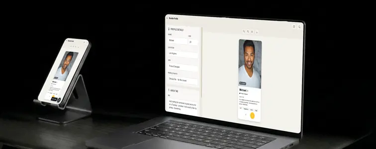
Bumble and Tinder get lumped together because they are both dating apps, but their screens look nothing alike, and that is exactly why a Bumble mockup needs its own treatment. The yellow accent buttons, the location pin, the badge layout, the way the photo fills the card. A mockup that borrows Tinder's layout and slaps a Bumble name on it gets caught by anyone who has used the app for more than a minute.
The Bumble Profile Mockup Generator in MockupTown renders the actual Bumble screen, so the details line up: the yellow like button, the black nope button, the profile fields in the right places, and the small touches that make the difference between "looks like Bumble" and "is clearly a mockup".
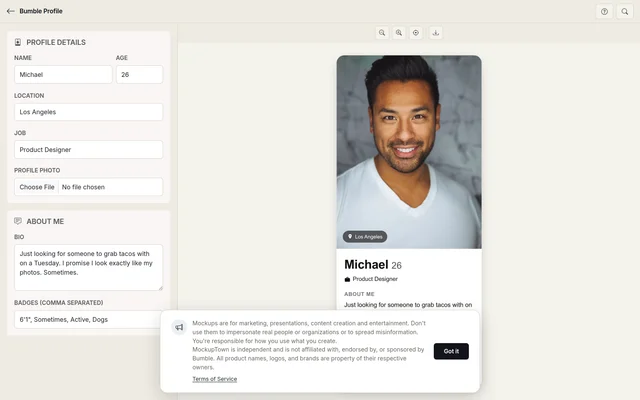 Bumble Profile Mockup Generator.
Bumble and Tinder look alike until they do not
Bumble and Tinder get lumped together because they are both dating apps, but their screens look nothing alike, and that is exactly why a Bumble mockup needs its own treatment. The yellow accent buttons, the location pin, the badge layout, the way the photo fills the card. A mockup that borrows Tinder's layout and slaps a Bumble name on it gets caught by anyone who has used the app for more than a minute.
The details that make it read as Bumble: the yellow like button, the black nope button, the profile fields in the right places, and the location badge pinned right on the photo.
The location pin does more work than it looks
The location here pulls weight that it does not on other apps, because it drives the map pin badge that sits right on the photo. A location anchors the profile to a place, which makes the card feel like a person who exists somewhere. It should also line up with the job line. A profile in Berlin that works at a New York company is a tell, because real profiles line up.
The badges belong to the same person
Badges are Bumble's version of the passion tags on Tinder, and they render as pills on the card. They are also the detail people check first when deciding whether a mockup is real. The badges should fit the person implied by the bio and the photo: same interests, same tone, same stage of life. A bio about hiking and craft beer with badges for clubbing and astrology reads as two different people welded together.
Building a card
Enter the name, age, location, and job, with the location consistent with the role. Upload a portrait photo. The card is photo-forward, so the image choice drives the whole feel. A neutral photo keeps the focus on the layout; a specific photo tells the story. Write the bio in the short, specific voice people actually use, and add the badges separated by commas. Preview the card, make sure the location pin and the button row look right, and download the mockup as a high-resolution PNG. Built entirely in the browser.
Getting the details right
- Keep location and job consistent. A profile in Berlin that works at a New York company is a tell. Real profiles line up.
- Use portrait photos. The card fills with the photo, and portrait images behave the way the real app expects.
- Write a bio with personality. "Brunch, bad puns, and pretending I exercise" reads as genuine. A bio that sounds like a product page reads as fake.
- Make badges match the bio. The pills should belong to the same person who wrote the text above them.
- Respect the yellow. The accent buttons are Bumble's visual signature. In the mockup, as in the app, they are what makes the screen recognizable.
Where people use Bumble mockups
- Dating app marketing. Feature demos, UI walkthroughs, and campaign art that need the recognizable yellow-on-black card.
- Content creation. Skits and blog posts about the app are funnier when the profile in the frame looks like the real thing.
- Presentations. Explaining the Bumble model or the women-message-first mechanic is far easier with the actual screen in the deck.
- Product demos. Designers building similar products use the mockup to illustrate the card pattern they are working with.
- A/B testing. Compare photos, bios, or badge sets side by side to see which combination reads the way you want.
Same honesty note as with every profile mockup: this is a fabricated screen, not a real person. Keep it for skits, demos, and examples. Presenting a mockup as an actual profile is deceptive and not what the tool is for.
When you need the card
The next time a Bumble screen settles an argument or sells an idea, you can make the exact profile instead of editing a real one.
Open the Bumble Profile Mockup Generator, set the details, add a photo, and write a bio with badges that fit the person you are depicting. Export the card as a PNG and move on.
Made with MockupTown, the free all-in-one mockup generator.
Frequently asked questions
Does Bumble Profile Mockup Generator cost anything?
It is free, and not trial-style free. Exports carry no watermark and there is no daily cap.
Are exports cleared for commercial work?
That is rather the point of the tool. Marketing teams routinely slot these exports straight into investor decks and ad creative.
Is signing up required?
Nope. No signup form, no OAuth popup, no continue-with-Google - straight to the canvas.
Can I add badges to the profile?
Yes. Add badge tags separated by commas and they render as pills under the bio, exactly the way the app shows them.