
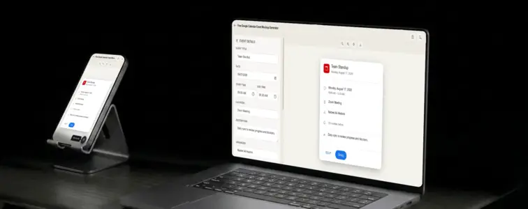
There is a specific kind of visual that every productivity blog, scheduling feature walkthrough, and internal training doc needs but nobody wants to build from scratch: a calendar event. Not a full calendar view, not a week grid, not a monthly overview. Just a single event card, the kind you see when you tap on something in Google Calendar. The title at the top, the time below it, the location pin, the organizer name, the colour bar running down the left edge. It is a small piece of UI, but it communicates an enormous amount of context in a single glance.
The problem is that building one by hand in a design tool takes longer than it should, because the details are precise and unforgiving. Google Calendar uses a specific font stack, specific spacing, specific colour values, and a specific layout that people recognise without thinking about it. Get any one of those wrong and the card looks like a website that borrowed Calendar ideas rather than the actual app. The Google Calendar Event Mockup Generator in MockupTown renders the real layout, so your mockup looks like it was pulled straight from the app.
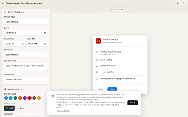 Google Calendar Event Mockup Generator.
Why Google Calendar is the default
Google Calendar dominates the productivity space. It is the calendar that comes with Gmail, the one that syncs with every meeting tool, and the one that most people have open in a browser tab right now. When someone sees a calendar event card, they are almost always picturing Google Calendar, even if they use something else. That familiarity is what makes it the default format for mockups.
The design carries specific signals. The clean sans-serif typography. The colour-coded event bars. The subtle grey dividers between sections. The small clock icon next to the time. The location pin next to the address. Each element is simple on its own, but together they create a visual language that people read instantly. A mockup that gets these details right inherits the credibility of the real app.
The event card is a story in miniature
A calendar event card tells a very specific story: what is happening, when it is happening, where it is happening, and who is involved. Each piece of information has a fixed place in the layout, and the hierarchy tells you what matters most.
The title sits at the top in the largest text, because it is the thing you need to see first. The date and time come next, because they determine whether the event is relevant to you right now. The location follows, because it tells you where to be. The organizer name appears at the bottom, because it answers the question of who set this up.
This hierarchy is not accidental. Google designed it to scan quickly, and your mockup should follow the same logic. Put the important information where the eye expects to find it, and the card reads as native.
The colour bar anchors the design
Every Google Calendar event has a coloured bar on the left side, and the colour is not decorative. It is a categorisation system. Red is often used for deadlines and urgent items. Blue is for meetings. Green is for personal time. Purple is for focused work. Yellow is for reminders.
The generator gives you access to the full Google Calendar colour palette, so you can pick the shade that matches the event type. This is the same system real calendars use, and following it makes your mockup feel like it belongs in the actual app rather than being a standalone design exercise.
The colour also affects the header icon background. When you pick a colour, the event icon updates to match, just like the real Calendar does. Such consistency is what divides a convincing mockup from one that looks assembled from spare parts.
The details that make it look real
- Use a specific time, not a range. "9:00 AM - 9:30 AM" reads as a quick sync. "2:00 PM - 4:00 PM" reads as a working session. The duration tells a story about the event type.
- Add a location when it makes sense. "Zoom Meeting" or "Conference Room B" reads as accurate. An empty location field is fine too, but a location adds context.
- Set a realistic title. "Team Standup" is a real event. "Q3 Strategy Review Meeting" is a real event. "AI-Powered Productivity Sync Session" is marketing copy wearing a calendar costume.
- Keep the description brief. One or two lines maximum. Real calendar descriptions are notes, not paragraphs.
- Pick the right colour for the event type. Red for deadlines, blue for meetings, green for personal time. This is the same system real calendars use.
Where a Google Calendar mockup earns its place
- Product demos. If your product integrates with Google Calendar, a mockup lets you show the integration in context without exposing private event data. You control every detail of what the reader sees.
- Pitch decks. Investor presentations use calendar mockups to show launch timelines, meeting schedules, or product roadmaps. A single event card communicates a date and a purpose faster than a bullet list.
- Documentation. User guides and onboarding material use calendar mockups to show what a scheduled event looks like in the actual app. It cuts down on confusion and keeps the instructions concrete.
- Blog posts. Articles about productivity, scheduling, or time management use calendar mockups as hero images and inline examples. A realistic event card gives the article a professional feel.
- Educational content. Course creators and trainers use calendar mockups to teach scheduling concepts, deadline management, and project planning. The visual makes the material approachable.
Building a Google Calendar event in two minutes
Open the Google Calendar Event Mockup Generator, enter the event title, date, start and end times, location, and description. Pick a colour from the Google Calendar palette. Choose light or dark mode. Export as a high-resolution PNG. Everything runs locally in your browser.
The whole process takes less time than creating a real calendar event, because you do not need to navigate the app, pick a calendar, or deal with timezone settings. You get the visual output you need without the overhead of the actual scheduling workflow.
One honest note: calendar mockups are for demonstrating your own product, presenting a concept, or illustrating an article. They are intended for design, training, and illustration purposes only, not for misleading audiences. Depict how an event could plausibly appear rather than copying anyone's actual schedule.
When your project needs a Google Calendar event visual, you can build the exact card instead of describing one in text. Open the Google Calendar Event Mockup Generator, set the details, pick a colour, and export a mockup that looks like it belongs in the real app.
Made with MockupTown, the free all-in-one mockup generator.
Frequently asked questions
Does this connect to my actual Google Calendar account?
No. The tool runs entirely in your browser. It does not read from or write to any Google account.
Are the colors the same as in Google Calendar?
Yes. The color picker uses the same event colors Google Calendar ships, tomato, tangerine, banana, basil, sage, blueberry and the rest.
Does the mockup include Google Meet links?
You can type a video conferencing link in the location field. The mockup displays it in the same position Google Calendar uses for meeting details.
Can I use this for Workspace admin documentation?
Yes. Several Workspace admins use these mockups to illustrate internal scheduling guides and shared calendar policies.