
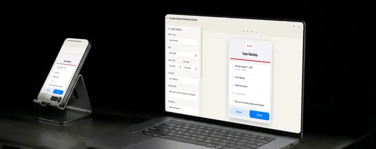
Apple Calendar has a visual identity that is instantly recognisable to anyone who uses an iPhone or Mac. The SF font stack, the rounded corners, the soft colour palette, the way the event card sits inside the app with a specific kind of quiet polish. It is the calendar that comes with the device, and because so many people carry iPhones, it is the calendar format that a large portion of your audience sees every day.
That familiarity is what makes an Apple Calendar mockup valuable. When someone sees an event card with the Apple styling, they immediately understand what they are looking at, because it matches the app they already use. The problem is that reproducing that styling by hand is tedious, because the details are precise: the font sizes, the corner radii, the specific shades of blue and grey, the way the time range is formatted. The Apple Calendar Event Mockup Generator in MockupTown renders the actual layout, so your mockup looks like it came from the real app.
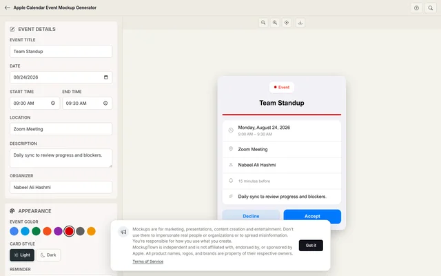 Apple Calendar Event Mockup Generator.
The Apple design language
Apple's design philosophy is built on clarity, consistency, and restraint. Every element in an Apple Calendar event card exists for a reason, and nothing is there just to look decorative. The typography is clean and readable. The spacing is generous. The colour palette is soft and intentional. The overall effect is calm and professional, which is exactly the feeling you want when presenting a scheduling concept.
This design language extends to every detail of the event card. The header uses the SF Pro Display font at a specific weight. The time range is formatted with an en-dash and no spaces around it. The location uses a smaller, lighter font. The colour bar on the left is a soft, rounded rectangle rather than a sharp edge. Each element follows Apple's human interface guidelines, and the generator respects all of them.
Why platform matching matters
When you are presenting a scheduling feature, a product demo, or a training document, the calendar platform you choose sends a signal about your audience. Google Calendar says startup and cross-platform. Outlook says enterprise and Microsoft ecosystem. Apple Calendar says individual professional, creative, and design-focused.
The choice is not arbitrary. A pitch deck for a creative agency looks different from one for a corporate consulting firm, and the calendar platform is part of that difference. The generator lets you pick the platform that matches your audience, so the mockup feels native to their world rather than borrowed from a different context.
The details that make it look like a real Apple event
- Use the SF font stack. The generator handles this automatically, but understanding why it matters helps you spot a good mockup from a bad one. Apple's typography is specific and consistent.
- Format the time correctly. Apple Calendar uses a specific time format: "9:00 AM - 10:30 AM" with an en-dash. The generator handles this, but it is worth checking.
- Pick a soft colour. Apple Calendar uses softer, more muted event colours than Google. The generator provides the actual Apple palette.
- Keep the description minimal. Real Apple Calendar descriptions are short notes, not paragraphs.
- Add a location when relevant. Apple Calendar shows locations with a small pin icon, and the format is clean and specific.
Where an Apple Calendar mockup fits
- iOS app demos. If your product integrates with Apple Calendar, showing the actual event card demonstrates the integration in a way that resonates with Apple users.
- Creative presentations. Design agencies, photographers, and creative professionals often work in the Apple ecosystem. An Apple Calendar mockup fits naturally in their presentations.
- Educational content. Course creators who target Apple users can show scheduling concepts in the calendar their students actually use.
- Blog posts. Articles about Apple productivity, time management on macOS, or iOS features benefit from realistic calendar visuals.
- Internal documentation. Teams that use Apple devices for their workflow can create training materials with the calendar they actually see every day.
Building an Apple Calendar event in two minutes
Open the Apple Calendar Event Mockup Generator, enter the event title, date, start and end times, location, and description. Choose light or dark mode to match the device theme. Export as a high-resolution PNG. Your data never leaves the browser.
The generator uses the actual Apple Calendar layout, with the SF font stack, the correct corner radii, and the accurate colour palette. The result looks like a screenshot from a real iPhone or Mac, not a hand-built approximation.
One honest note: calendar mockups are for demonstrating your own product, presenting a concept, or illustrating an article. They serve design training and illustration purposes alone, never deception. Show what an event could look like, not what someone else's calendar contains.
When your project needs an Apple Calendar event visual, you can build the exact card instead of describing one in text. Open the Apple Calendar Event Mockup Generator, set the details, pick a theme, and export a mockup that looks like it belongs in the real app.
Made with MockupTown, the free all-in-one mockup generator.
Frequently asked questions
Does the mockup use Apple's SF font?
The layout follows Apple's design language with the SF font, rounded corners and soft colour palette.
Is this compatible with App Store screenshot requirements?
The exported PNG is high-resolution and sized for use in App Store screenshots, marketing pages and presentation materials.
Does it connect to iCloud?
No. The tool runs entirely in your browser. No Apple ID, no iCloud connection and no calendar sync.
Can I show Siri or Shortcuts integration?
You can type Siri-suggested or Shortcuts-triggered event text in the title or description fields. The mockup does not render Siri UI, but the event details are fully customizable.