
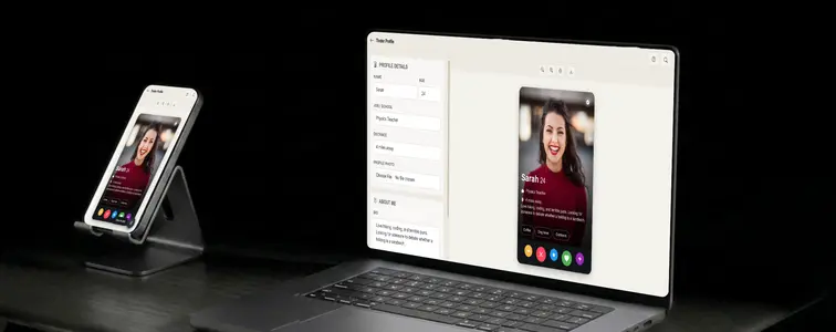
The Tinder screenshot is a fixture of internet comedy and a surprisingly common prop in marketing. Dating app founders demo their UI with them, content creators use them for skits, comedians mock up the worst possible profiles, and product people borrow the layout to explain the whole swipe mechanic in one frame.
But the profile screen is also one of the easiest things to get obviously wrong. The name and age at the top, the distance line, the job and school row, the full-bleed photo, the passion tags, the stack of action buttons at the bottom. Miss any of it and it stops looking like Tinder. The Tinder Profile Mockup Generator in MockupTown renders all of it for you.
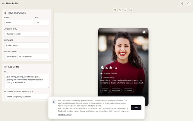 Tinder Profile Mockup Generator.
The profile screen explains the whole mechanic in one frame
The reason a Tinder mockup works in so many contexts is that the layout is universally recognizable. Name, age, location at the top. A full-bleed photo behind everything. The job and school row. Passion tags stacked above the action buttons. Anyone who has used the app reads the screen instantly, even in a slide deck or a blog post.
The details that make it read as a real card
- The distance line. Small, easy to skip, and exactly the kind of element that makes a mockup instantly feel like the real screen.
- The passion pills. Passions are the signature Tinder detail. Type them as a comma-separated list and they render as the little pills below the text, anchoring the "this is a real profile" feeling faster than almost anything else.
- The button stack. The realistic row at the bottom makes the mockup read as a complete interface rather than a cropped fragment.
- The verified badge. A blue badge, toggled on or off, styled to match the app.
The profile has to tell one story
The name, age, job, and distance should be consistent. Real profiles pair a name with a job and a plausible place to live, and the two together tell the whole story the screenshot is meant to tell. A profile in New York with a job in Berlin does not line up. The same goes for the bio and the passions: the pills should feel like they belong to the same person who wrote the text above them.
Writing a bio that sounds like a person
Tinder bios are short, specific, and carry a bit of personality. "Coffee, hikes, and my dog" reads as genuine; a bio that reads like a corporate mission statement reads as a mockup. If the mockup is a generic example, a neutral photo keeps the focus on the layout. If it is for a skit or an ad, the photo does most of the comedic or persuasive work, and the bio should match the tone it sets.
The quick build
Enter the name, age, and job or school, then upload the profile photo. Portrait is the natural fit for the full-screen layout. Write the bio and add the passions as a comma-separated list. Decide whether the profile is verified, preview the screen, and download it as a high-resolution PNG. Everything runs locally in your browser.
Where Tinder mockups actually show up
- Dating app marketing. Product and UI demos, feature announcements, and case studies that need a realistic screen.
- Content creation. Skits, YouTube thumbnails, and blog posts about online dating are far funnier with a well-made mockup profile.
- Presentations. The swipe mechanic and profile layout are easier to explain with a concrete screen than with words.
- UI and product demos. Designers building similar products use the mockup to illustrate the pattern they are borrowing or improving.
- A/B testing. Compare how different photos, bios, or passion tags change the feel of a profile, side by side.
The standard note applies here more than most places: this is a mockup, not a real person. Using one to pass off as an actual profile is dishonest and, depending on where it lands, could be someone's actual reputation. Keep it in skits, demos, and examples, where it belongs.
When you need the exact card
The next time a project needs a dating app screen, you can build the exact profile instead of digging through screenshots.
Open the Tinder Profile Mockup Generator, set the details, drop in a photo, and write a bio that sounds like a person. Export the mockup as a PNG and you are done.
Made with MockupTown, the free all-in-one mockup generator.
Frequently asked questions
Do I have to pay for Tinder Profile Mockup Generator?
Nothing up front and nothing monthly. The download button behaves identically whether or not you ever pay.
May I use these in client projects?
Unrestricted. Client work, ads, product pages - all fair game, attribution optional.
Do I have to register first?
Never. Refresh and your draft disappears - by design, since nothing you type is uploaded.
Can I add passion tags to the profile?
Yes. Add passion tags separated by commas and they render as pills below the bio, exactly the way the app shows them.