
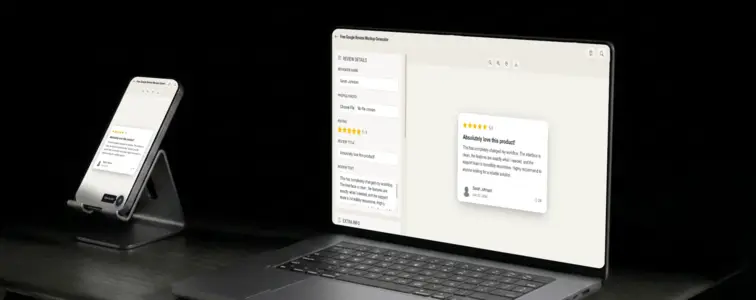
Google Reviews are the internet's default trust signal. When someone searches for a restaurant, a plumber, a SaaS tool, or a local business, the first thing they look at is the star rating. The yellow stars, the review count, the reviewer name and photo. This visual language is so deeply embedded in how people evaluate businesses that a review card in Google styling immediately shapes perception, regardless of the actual content.
That is what makes a Google Review mockup valuable. When you need to show what customer feedback looks like, or demonstrate a review feature, or create a landing page section that communicates trust, the Google Review format is the one that most people recognise instantly. The problem is that building a convincing Google Review card by hand is tedious, because the details are specific and unforgiving. The Google Review Mockup Generator in MockupTown renders the actual layout, so your mockup looks like it was pulled straight from Google.
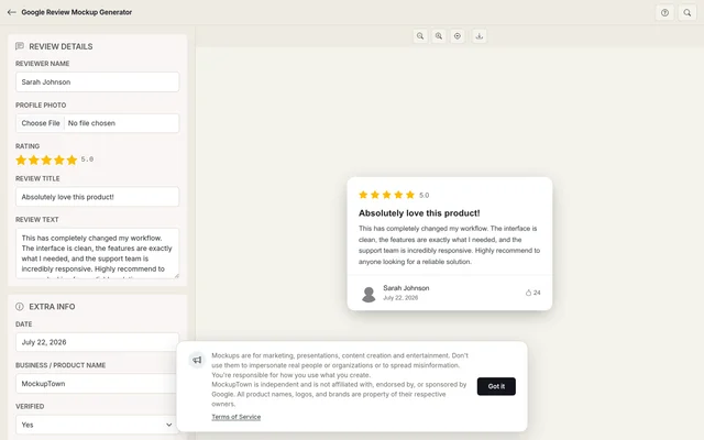 The Google Review Mockup Generator workspace - review details on the left, live card preview on the right.
Why Google Reviews are the default
Google Reviews dominate the review landscape. They appear in search results, in Google Maps, in local business profiles, and in countless third-party integrations. When someone thinks "online review," they are almost always thinking of Google Reviews, even if they have never consciously registered it.
The design carries specific signals. The yellow star bar is instantly recognisable. The reviewer name and photo sit below the stars. The date and "Local Guide" badge add context. The helpful count at the bottom indicates community validation. Each element is simple on its own, but together they create a visual language that people read without thinking about it. A mockup that gets these details right inherits the credibility of the actual Google platform.
The anatomy of a Google Review card
A Google Review card has a specific structure that the generator reproduces accurately:
- The star rating at the top. Five yellow stars, with the numeric rating displayed beside them. This is the first thing people see, and it sets the expectation for the rest of the card.
- The review title. Not all Google Reviews have titles, but when they do, they appear in bold below the stars. A good title is specific and opinionated.
- The review body. The main text of the review, in a readable font size with comfortable line spacing. Real reviews are messy: they have line breaks, casual language, and specific details.
- The reviewer profile. Name, photo, and optionally the "Local Guide" badge. This is where first impressions are formed.
- The date. When the review was posted. A recent date reads as current; an old date reads as established.
- The helpful count. How many people found the review useful. This reinforces community validation without being heavy-handed.
The reviewer identity matters more than the text
The name and photo above a review do most of the persuading. A review from "Sarah Johnson" with a real photo reads differently than a review from "User12345" with no photo. The generator lets you set the reviewer name and upload a profile photo, or use the default avatar.
The photo matters more than people think. A real photo makes the review feel grounded and genuine. A default avatar makes it feel anonymous. Pick the one that matches the story you are telling.
The name should match the kind of reviewer that would leave this kind of review. A first name with a last initial reads as casual and real. A full name with a company title reads as professional. Both work, but they work in different contexts.
Star ratings are not decoration
The star rating is the first thing people see, and it sets the expectation for the rest of the card. A five-star review with lukewarm text reads differently than a four-star review with the same words. The rating is part of the message, and the two should agree.
Google uses a five-star scale with yellow filled stars. The generator renders this accurately, with the correct star size, spacing, and colour. The numeric rating appears beside the stars, formatted as "4.0" or "5.0" exactly as Google displays it.
The details that separate a good mockup from a bad one
- Keep the review text natural. Real reviews are messy. They have line breaks, casual language, and specific details. A paragraph of polished marketing copy does not read as a review.
- Set a realistic date. A review dated "January 1, 2026" looks manufactured. A date from a few weeks ago looks current.
- Match the rating to the text. A five-star review should sound enthusiastic. A three-star review should sound mixed. The two should agree.
- Use the helpful count sparingly. A review with 4,000 helpful votes on a small business reads differently than on a major product. Keep the numbers proportional.
- Add the Local Guide badge when appropriate. Google's Local Guide programme strengthens the impression, but not every reviewer is a Local Guide.
Where a Google Review mockup earns its place
- Landing pages. The most common use: a row of review cards below the hero section, showing what customers think of the product. The Google format is the most widely recognised.
- Pitch decks. Investor presentations use review cards to demonstrate customer satisfaction without pulling real data. The Google format reinforces the message.
- Case studies. A review card gives a case study a concrete, visual example of customer feedback.
- Social media. Screenshot-style review cards are a format that works on Instagram, LinkedIn, and Twitter. The Google format is instantly recognisable.
- Documentation. Guides about customer feedback and review management use mockups to show platform-specific examples.
Keep this in mind: is important: review mockups are for presenting your own work and demonstrating platform layouts. Using them to fabricate customer feedback for a real product crosses a line that is not worth crossing. A mockup should demonstrate a plausible review, not reproduce a real person's text.
Building a Google Review card in two minutes
Open the Google Review Mockup Generator, enter the reviewer name, star rating, review title, and review text. Add a date and optional helpful count. Upload a profile photo or use the default avatar. Export as a high-resolution PNG. Nothing leaves your machine.
The generator uses the actual Google Review layout, with the yellow star bar, the correct typography, and the faithful spacing. The result looks like a screenshot from a real Google search result, not a hand-built approximation.
When your project needs a Google Review visual, you can build the exact card instead of describing one in text. Open the Google Review Mockup Generator, set the details, and export a mockup that looks like it belongs in the actual search results.
Made with MockupTown, the free all-in-one mockup generator.
Frequently asked questions
Does this pull real reviews from Google?
No. The mockup is built from scratch in your browser. Nothing is fetched from Google's servers.
Can I show the Local Guide badge?
Yes. The editor includes a toggle for the Local Guide badge, which displays next to the reviewer name just as it does on a real Google review.
How does the star rating work?
Choose any rating from 1 to 5 stars. The stars use Google's exact yellow colour and sizing.
Can I add photos to the review?
Yes. The mockup supports a photo row below the review text, using the same thumbnail grid layout Google uses for photo reviews.