
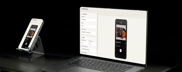
The Spotify now playing screen is one of the most recreated interfaces on the internet. Musicians tease unreleased tracks with it, designers use it to show off album art, brands borrow it for everything from podcasts to merch announcements, and half of social media uses it to recommend music without writing a sentence.
Part of the appeal is that it is small and instantly recognizable. The album cover, the song and artist underneath, the progress bar, the row of controls. All of it has to be right, though. The font of the song title, the position of the play button, the way the background blurs the cover art. The Spotify Now Playing Mockup Generator in MockupTown reproduces the whole screen, so you never have to trace it by hand.
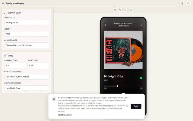 Spotify Now Playing Mockup.
How the album art sets the mood
The thing that is hardest to fake by hand is the background. Real Spotify screens blur the cover art into the backdrop, which gives the whole screen its depth. The generator builds that automatically from the artwork you upload, which is the difference between a screen that looks native and one that looks assembled.
The progress bar has to tell the truth
A progress bar whose filled portion does not match the displayed times is exactly the kind of detail that makes a mockup fall apart. The generator turns the current and total times into the right percentage automatically, so the fill always matches the numbers. Pick a current time that makes sense: a song at 3:47 of 3:52 is mid-song, while 0:12 reads as freshly started.
The screen in under a minute
Set the song title, artist, and context line. The context is a detail people overlook until it is missing: real screens show what the track is part of, a playlist or an album, above the song title. Upload a square image as the album cover, and the generator creates the blurred background from it. Set the progress, and the control row (play or pause, skip, shuffle, repeat) falls into place. Preview and export as a high-resolution PNG. Everything stays on your device.
The details that keep it realistic
- Use square artwork. Album covers are square, and a non-square image will look off in the cover slot and in the blurred background.
- Make the times add up. Keep the current time below the total time. A track "1:03 of 0:45" is an instant giveaway.
- Write a real context line. "Playing from Midnight City" or "From the album Patterns" sounds like the app. A blank context line looks empty.
- Match the art to the mood. The mockup is half artwork, half layout, so the cover choice does most of the emotional work.
- Use the controls correctly. A paused track shows a play button, not a pause button. Small consistency like that is what makes a mockup pass.
Where people actually use these
- Music marketing. Teaser posts for releases, album announcement graphics, and playlist promotions that show the track in its natural home.
- Presentations. Spotify screenshots show up in pitch decks about music, podcasts, and media, where a real-looking player beats a wireframe.
- Content creation. YouTube thumbnails and blog posts about music get a lift from a recognizable now playing screen.
- Social media. A music recommendation shared as a Spotify screenshot is faster to parse than a text caption, which is why the format spread in the first place.
- A/B testing. Compare how the same track reads with different artwork or different context lines, side by side.
Worth mentioning: here is short: teasing your own release with a mockup is fine, and recommending music with one is fine. Passing off a fake player as a real screenshot of someone else's listening activity is not, and it is easy to spot when the song does not exist.
When you need the exact screen
When you need a now playing screenshot, whether for a release, a thumbnail, or a deck, you can make the exact screen in under a minute.
Open the Spotify Now Playing Mockup Generator, set the song and artist, drop in the artwork, and set a progress bar that makes sense. Export the mockup as a PNG and it is ready to use.
Made with MockupTown, the free all-in-one mockup generator.
Frequently asked questions
How much does Spotify Now Playing Mockup cost?
Nothing at all. Playback previews render on your own hardware, which is what keeps the price at zero.
Is commercial use allowed?
You own what you export, full stop. Ads, prints, merchandise - every channel is fine.
What about accounts or logins?
There is nothing to register for. You would struggle to find where to sign up, because that option does not exist.
Can I use my own album artwork?
Yes. Upload any square image as the artwork and it becomes both the cover art and the blurred background of the player.