
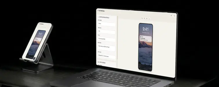
There is one screenshot that appears in almost every app marketing asset, and it is not a screenshot of the app itself. It is a screenshot of a notification. App store listings use it, launch announcements use it, pitch decks use it, and entire campaigns are built around showing what a single alert from your app looks like on a real lock screen.
That is a smart instinct, because a notification screenshot does two jobs at once: it shows the app exists, and it shows the app is worth interrupting you for. The problem is that a push notification has almost no pixels to work with, so every detail counts. The app icon shape, the frosted glass card, the wallpaper behind it, the clock at the top. The Push Notification Mockup Generator in MockupTown renders the whole lock screen, so your mockup looks like it was pulled straight off a real iPhone.
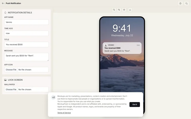 Push Notification Mockup Generator.
The screenshot that is never a screenshot of the app
There is one screenshot that appears in almost every app marketing asset, and it is not a screenshot of the app itself. It is a screenshot of a notification. App store listings use it, launch announcements use it, pitch decks use it, and entire campaigns are built around showing what a single alert from your app looks like on a real lock screen.
That is a smart instinct, because a notification screenshot does two jobs at once: it shows the app exists, and it shows the app is worth interrupting you for. The problem is that a push notification has almost no pixels to work with, so every detail counts.
Every pixel is the product
The app icon shape, the frosted glass card, the wallpaper behind it, the clock at the top. A notification is a small UI with no room for error, and the little details are what make it feel native. The frosted glass card is the iOS signature: semi-transparent, blurred, correctly rounded. The wallpaper gets the dark overlay iOS uses, which keeps the notification readable and makes the screen look native. The clock and date at the top anchor the whole thing in a specific moment.
The message body is where the persuasion happens
The title names the thing and the message says what happened, and both fit in roughly two lines. That is all the space you get, so the copy has to be written as a real notification, not as ad copy. The wording of a push is a genuine conversion lever, and the mockup is the place to test it. Keep it short. A wall of text on a lock screen is the fastest giveaway. The title and message should sound like something your actual product would send, not like a marketing tagline.
The small details that keep it realistic
- Set a sensible time-ago. "Just now" pairs with a fresh message; a stale "2 days ago" next to time-sensitive copy contradicts the story.
- Use a square icon. The generator rounds it for you, but starting square keeps the icon crisp.
- Match the wallpaper to the moment. A generic gradient is fine; a photo that suits your product's mood is better. Tall images fill the lock screen correctly.
- Keep the message to two lines. That is the shape real notifications take.
The two-line assembly
Enter the app name, the time it arrived, and the title and message body. Upload a square image of your app icon, and the generator applies the iOS rounding and sizing. Add a tall lock screen wallpaper, and the dark overlay is applied automatically. Preview the full lock screen, with the clock, frosted card, and message, and download it as a high-resolution PNG. Nothing leaves your machine.
Where push notification mockups get used
- App marketing. The flagship use: showing your notification in an app store listing or a launch announcement, because it demonstrates value in one frame.
- Presentations. Pitch decks for apps and products frequently use a notification mockup as the hero image, since it shows the product in context.
- Documentation. User guides and onboarding material use notification examples to show what a feature's alert looks like.
- Social media. Feature announcements are shared as notification screenshots, a format users recognize instantly.
- A/B testing. Compare two versions of notification copy side by side, because the wording of a push is a real conversion lever.
Important: for this format is short. Push notification mockups are for showcasing your own product's design and copy. The one thing to avoid is pretending your app actually sent a notification to a real person, especially with a message that could mislead. Show what your notification could look like, not what someone else received.
When you need the exact lock screen
The next time your app needs that one hero screenshot, you can build the exact lock screen instead of borrowing a stock notification.
Open the Push Notification Mockup Generator, write the notification copy, drop in your app icon and a wallpaper, and export a mockup that looks like it belongs on a real iPhone lock screen.
Made with MockupTown, the free all-in-one mockup generator.
Frequently asked questions
Does Push Notification Mockup Generator cost anything?
Yes, and no credit card is ever asked for. The download button behaves identically whether or not you ever pay.
Are exports cleared for commercial work?
Yes - exports are yours to use anywhere. Client work, ads, product pages - all fair game, attribution optional.
Is signing up required?
There is no sign-up step anywhere in the product. You would struggle to find where to register, because the option does not exist.
What image sizes work best?
For best results, use square images for app icons and tall images for wallpapers.