
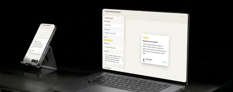
App Store reviews are the trust signal for mobile apps. When someone is deciding whether to download an app, they look at the rating, the review count, and then they read the reviews. The star rating gets them interested. The reviews decide whether they actually tap "Get." This is the conversion funnel for every app in the store, and the review card is where the decision happens.
That is what makes an App Store review mockup valuable. When you are building an app marketing page, a pitch deck, or a case study, showing realistic App Store reviews communicates that your app is trusted by real users. The problem is that building a convincing App Store review card by hand is tedious, because the details are specific to Apple's design system. The App Store Review Mockup Generator in MockupTown renders the actual layout, so your mockup looks like it was pulled straight from the App Store.
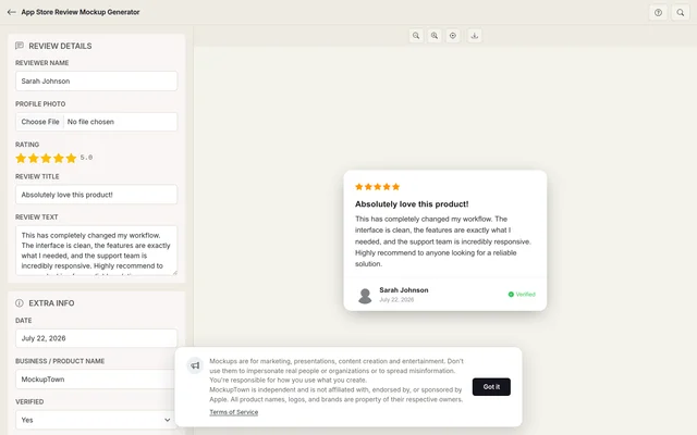 App Store Review Mockup.
Why App Store reviews carry unique weight
App Store reviews are different from other review formats because they are tied to a specific app and a specific version. When someone reads an App Store review, they are reading feedback about the exact thing they are considering downloading. This creates a different kind of trust than a general business review, because the context is so specific.
The design reflects this specificity. The App Store review card is clean and focused, with the iOS design language that Apple users recognise immediately. The typography is the SF font stack, the spacing is generous, and the overall feeling is calm and professional. The verified purchase badge adds another layer of trust, because it confirms that the reviewer actually downloaded and used the app.
The anatomy of an App Store review card
An App Store review card has a specific structure that the generator reproduces accurately:
- The star rating at the top. Five orange stars, displayed prominently. The orange colour is specific to the App Store and distinguishes it from Google's yellow or Yelp's red.
- The review title. Bold text below the stars. App Store review titles are often short and specific, summarising the reviewer's opinion in a few words.
- The review body. The main text of the review. App Store reviews tend to be focused on specific features or experiences, because the reviewer is talking about a specific app.
- The reviewer profile. Name and date. App Store reviews show the reviewer's name (which may be a nickname) and the date of the review.
- The verified purchase badge. A blue checkmark that confirms the reviewer downloaded the app from the App Store. This strengthens the impression.
The verified purchase badge matters
The verified purchase badge is one of the most important elements in an App Store review. It tells the reader that the reviewer actually downloaded and used the app, rather than just leaving a random opinion. This adds a level of trust that other review formats do not always have.
The generator lets you toggle the verified badge on or off, so you can show reviews with or without the badge depending on the context. For marketing materials, the badge strengthens the impression. For educational content about review formats, showing both states demonstrates the difference.
The details that make it look like a real App Store review
- Use the orange star rating. App Store stars are orange, not yellow or red. The generator handles this automatically.
- Make the review specific. App Store reviews tend to focus on specific features or experiences. "Great app, love the new dashboard" reads as genuine. "This app changed my life" reads as generic.
- Add the verified badge when appropriate. The badge adds weight, but not every review has one. Use it when it makes sense.
- Format the date correctly. App Store reviews show the date in a specific format. The generator handles this.
- Keep the reviewer name realistic. App Store reviewer names are often nicknames or first names, not full legal names.
Where an App Store review mockup earns its place
- App marketing pages. The most common use: showing what users say about your app in the format people actually use to evaluate apps. The App Store format is the industry standard for mobile.
- Pitch decks. Investor presentations use App Store review mockups to demonstrate user satisfaction and app quality. The format is instantly recognisable.
- ASO documentation. Guides about app store optimisation use App Store review mockups as examples of what good reviews look like.
- Blog posts. Articles about app marketing, mobile UX, or review management benefit from realistic App Store visuals.
- Educational content. Mobile development courses use App Store review mockups to teach students about the app ecosystem.
Before you export: is important: review mockups are for presenting your own work and demonstrating platform layouts. Using them to fabricate user feedback for a real app crosses a line that is not worth crossing. Show what a review could look like - never pass off someone else's actual words.
Building an App Store review card in two minutes
Open the App Store Review Mockup Generator, enter the reviewer name, star rating, review title, and review text. Add a date and optional verified badge. Export as a high-resolution PNG. No server involved, everything is local.
The generator uses the actual App Store review layout, with the orange star rating, the SF font stack, and the faithful spacing. The result looks like a screenshot from a real App Store listing, not a hand-built approximation.
When your project needs an App Store review visual, you can build the exact card instead of describing one in text. Open the App Store Review Mockup Generator, set the details, and export a mockup that looks like it belongs in the actual store.
Made with MockupTown, the free all-in-one mockup generator.
Frequently asked questions
Does this pull reviews from the App Store?
No. All text is entered manually in the editor and rendered locally in your browser. No App Store data is fetched or stored.
Can I set the app version number?
Yes. The version number field lets you specify which release the review is associated with, matching how Apple ties reviews to app versions.
What does the "Most Helpful" label do?
It is an optional toggle that adds the "Most Helpful" indicator Apple applies to top-voted reviews. It changes how authoritative the mockup reads.
Does it use the San Francisco font?
Yes. The mockup renders text in Apple's San Francisco font for authentic iOS styling.